[02]Case study
← All workWestern Sydney Recovery Care
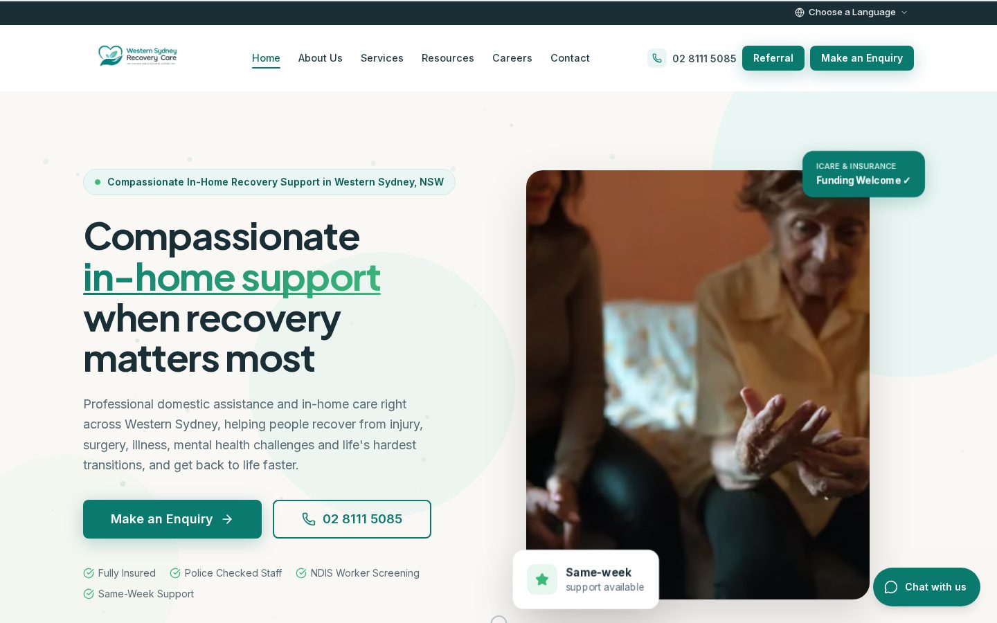
A considered, reassuring digital presence for a care provider.
[A]Who it was for
A care-focused organisation supporting people and families in Western Sydney.
[B]The problem
Communicate sensitive services with warmth and clarity, and make it easy for families to get in touch.
[C]Our approach
A softer, readable design language with generous spacing, plain-language headings and visible contact options.
[D]Responsive implementation
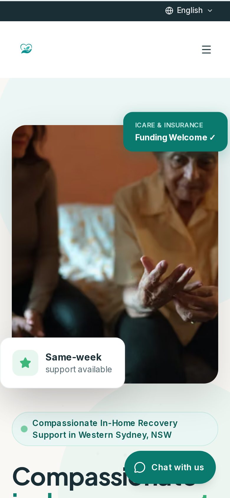
Composed for the phone, not squeezed onto it.
Most visitors meet a local business on their phone. The mobile layout keeps key information and calls to action within easy reach, with type and spacing adjusted for smaller screens.
Captured from the live website.
[E]What makes it work
- 1
Plain-language headings
Services explained simply, without jargon.
- 2
Generous, readable layout
Comfortable spacing and type for visitors of every age.
- 3
Visible contact options
Help is always one step away.
[F]Technical highlights
- Readable typographic scale
- Mobile-first templates
- Accessible forms
[G]Business value
[Verified results to be added once confirmed with the client.]
Next project
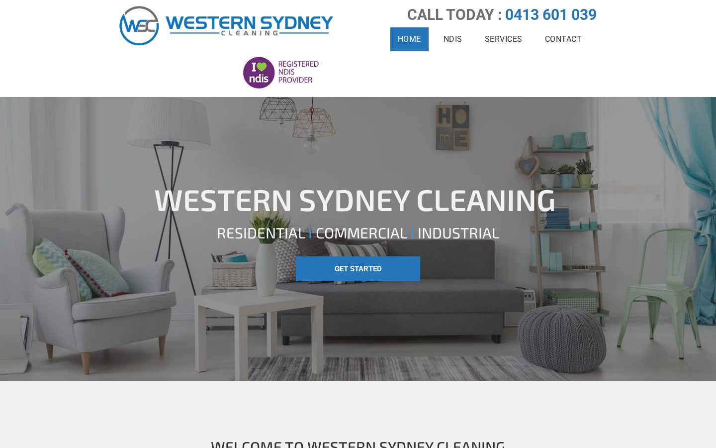
Western Sydney Cleaning →